Top 3 Must-Haves for Your Capital Campaign’s Web Page

The following is a guest post written by Ira Horowitz, Co-founder of Cornershop Creative. Learn more about Ira at the end of the post.
After a whirlwind of a year for the nonprofit sector, organizations of all shapes and sizes are looking for ways to shore up support and strengthen relationships with key donors. For many nonprofits, growing their fundraising capacity with major campaigns is a feasible (and courageous) move for 2021.
If you’re already in the process of planning or executing a major capital campaign, capacity campaign, or endowment campaign for your organization, you know that these undertakings are major investments of time and resources. Sustainably growing your organization is hard work that requires support from donors of all sizes. This is especially true now, when your typical prospecting strategies might be shaken up by ongoing economic disruptions.
The challenges of 2020 have made it more important than ever to go all-in on marketing once your campaign advances to its public phase. While you’ve likely already hit 65-80% of your fundraising goal by this stage, that doesn’t mean you can rely solely on your existing base of support or neglect actively expanding your audience.
To anchor all of your campaign’s public marketing efforts, we recommend creating a dedicated web page or microsite for the initiative. Why? There are a few key reasons. A dedicated campaign page will help with:
- Extending your reach online and boosting your campaign’s visibility
- Collecting more mid-size and smaller donations online
- Boosting transparency with easily-accessible updates and announcements
- Generating more data and contacts for future outreach
At Cornershop Creative, we’ve worked with organizations of all sizes across the nonprofit sector with web design, technical strategy, and long-term maintenance. We’ve seen firsthand the difference that the right strategic design and technical elements can have on a site’s ability to engage and convert donors. This is always important for nonprofits, but it’s especially critical when you’re working to drive a major campaign to completion.
Let’s walk through our top three must-haves for a capital campaign web page on your website:
- Effective design elements
- A high-performing donation form
- Interactive and responsive features
These essentials will help you cover your bases when it comes to creating an effective campaign page that will both safeguard all the progress you’ve made leading up to the public phase and help you raise more from your broader base of support. Let’s dive in.
Looking for hands-on guidance with planning your capital campaign? Request your free strategy session to speak with a fundraising expert.
1. Effective Design Elements
Effective visual design is essential for creating a positive impression for visitors on any page of your website, but it can play an active role in boosting engagement and conversions, too. For a capital campaign page, you’ll want to prioritize the user’s experience everywhere.
Take a note from a few of the Cornershop team’s favorite nonprofit websites. These examples all feature highly effective design elements. For your campaign’s page, we especially recommend the following best practices.
Clean, bold design
The emphasis should be on your campaign and its goals, not just on your organization. This stage of your campaign should aim to grow your audience of supporters. Hooking them with your campaign and then encouraging them to learn more about your organization will be a more effective strategy than the other way around.
Chances are you already have a concrete slogan, theme, and visual brand that you’ll use in your marketing materials. This web page is the most important place to make use of the campaign’s marketing collateral. Keep your design clean and streamlined, leading with high-impact images and calls to action rather than blocks of text.
Impactful visual elements
Photos of your constituents and your mission in action are invaluable for motivating supporters. Use impactful photos and well-designed graphics to illustrate your campaign and its goals.
For instance, if you’re raising capital to construct new facilities, highlight a beautiful rendering of your project. Draw readers in, then encourage them to further engage with your campaign and digital content with photos, graphics, and bold buttons.
We also recommend including responsive campaign trackers near the top of the page (more on this later).
Intuitive navigation
If you’ll be creating a dedicated microsite for your campaign, make sure to include an intuitive navigation bar at the top. Visitors should be able to immediately find exactly what they’re looking for. You’ll likely want to include links to:
- Your campaign’s donation form
- A page explaining the campaign and its goals
- Your organization’s main website
- A virtual recognition wall featuring donors who’ve already contributed
- Your campaign’s blog or announcement feed
- A “contact us” page
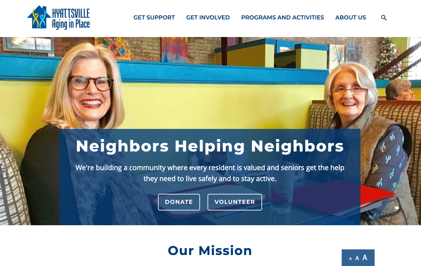
Here’s an example of a nonprofit website that puts these best practices into action. Hyattsville Aging in Place’s homepage includes an intuitive navigation bar, leads with an impactful image of constituents, emphasizes clear calls to action, and uses a simple layout that prioritizes user experience:

Overall, your campaign page should avoid jumbling too much information in one place, and instead create clearly demarcated sections (or even separate pages of a microsite) that make it easy for visitors to stay engaged. What do you ultimately want visitors to do once they’re on your page? Structure your layout to prioritize that journey.
Making a donation is almost certainly a primary goal here, so including an embedded donation form near the top of your campaign page can help you capture more support immediately (more on this below).
2. A High-Performing Donation Form
For a capital campaign, the bulk of your funding will come in the form of major donations that have already been secured by the time you’re promoting the campaign’s web page to the general public.
While your team focuses heavily on personally cultivating relationships with those major donors, you won’t have the time or resources to take such a personal approach to all of the mid-size and smaller donations that will drive your campaign to completion. That’s where your online donation form comes in.
A high-performing donation page will be essential for seamlessly guiding donors through the process of contributing. This is the most critical touchpoint between donors and your campaign, so you’ll need to make sure your donation actively facilitates the process rather than slows it down. Here are our top recommendations:
- Embed the donation form prominently on the page. Don’t force donors to leave your campaign’s web page in order to make a donation on a separate platform. Embedding the form directly on the campaign’s main page will keep the process quicker and more directly connect their gift to that particular campaign. Modern donation software and help from web designers should make it easy to embed your form.
- Keep your required fields to a minimum. The last thing you’ll want to do at this stage is to slow down your potential donors. Only ask for the minimum required information you’ll need to process their gift, like their name, contact information, donation amount, and payment information. If you want to learn more about your donors, you can always ask them to fill out an additional question or two on the confirmation page after you’ve secured their gift.
- Provide suggested giving amounts. Take the guesswork out of the process by suggesting a range of suggested donation amounts. First, determine the average donation you’ll need during the public phase to reach your goals. Then, build a tier of suggestions around that average. One amount on the lower end, another at or slightly above your average, and one or two higher amounts should help encourage donors to give more than they might have initially.
Check out DNL OmniMedia’s donor segmentation guide for an overview of how to define the specific supporter segments your page will need to target.
- Provide subscription options. Include an option for donors to opt-in for your campaign updates and announcement emails directly on the donation form. This can dramatically simplify the process of keeping supporters in the loop, encouraging further engagement, and stewarding their support over the long run. This option should simply be a checkbox for donors to check during the donation process, making the process as quick and streamlined as possible.
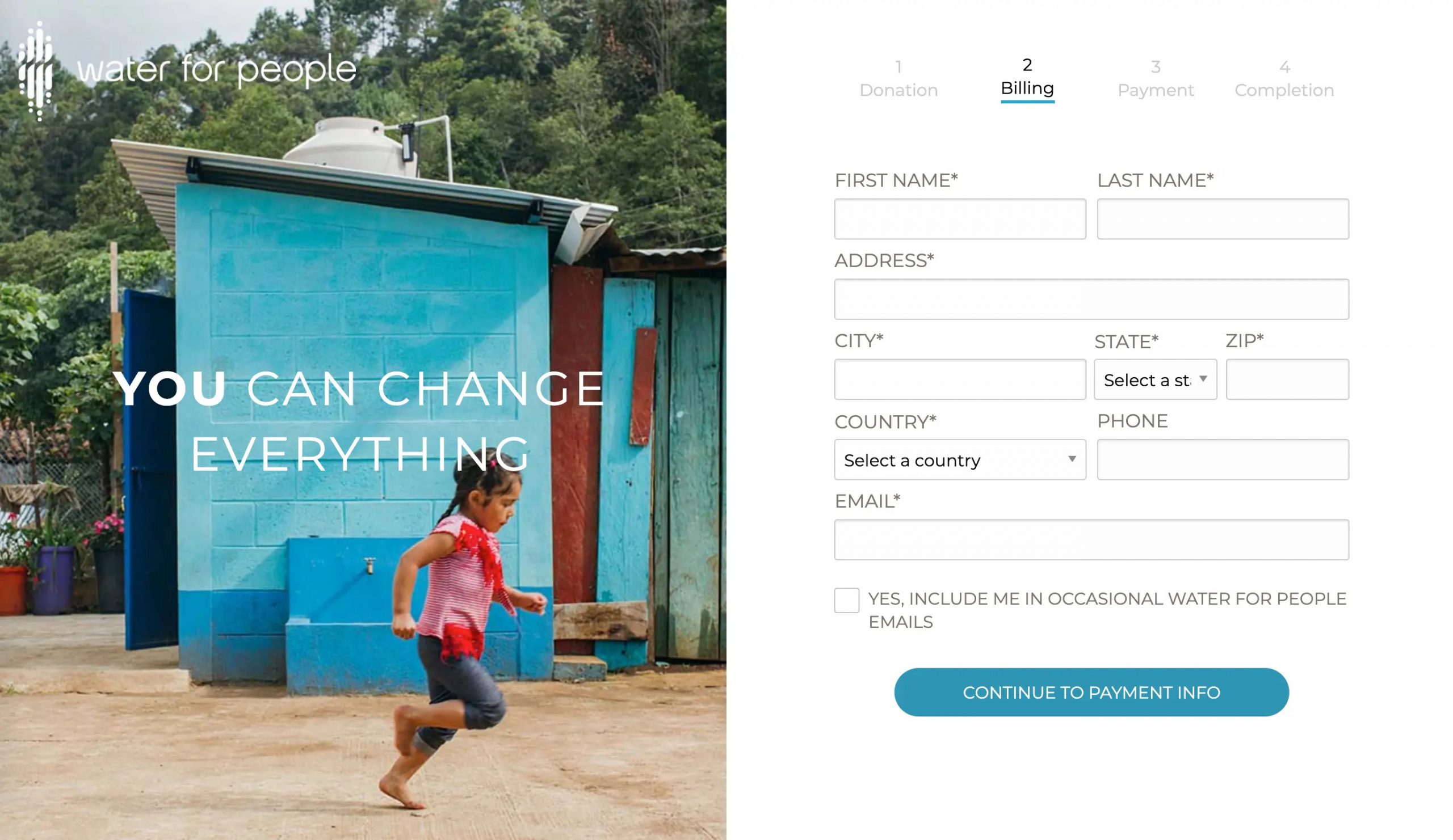
A one-page donation form is ideal to keep the process quick and easy for donors, but multi-page donation forms are also effective when they’re designed well. Here’s an example from Water for People:

This donation form clearly shows donors where they are in the process, reassuring them that each stage has a purpose and won’t take long to complete. Note the email opt-in checkbox, too!
3. Interactive and Responsive Features
Your campaign website should actively engage visitors, increasing their interest for and investment in your success. Use interactive features to show visitors in real-time the impact that their gifts can have. Try these strategies:
- Progress thermometers and countdowns. Deadlines are an essential part of driving major campaigns to success and ensuring accountability. A progress tracker visually shows donors how close you are to reaching your goals or how long your campaign will run for, both of which can be powerful motivators to give.
- Embedded social feeds. Embed a real-time feed of your social media posts or mentions on your campaign page. This will encourage more multichannel engagement with your campaign and will show visitors that your community is buzzing with excitement and conversation.
- Donor recognition displays. Scrolling real-time displays to recognize gifts as they come in is an excellent way to show your gratitude and responsiveness. Donor recognition is a critical part of stewardship. While you might create a physical recognition wall to honor major donors, don’t neglect the opportunity to publicly thank everyone on your web page.
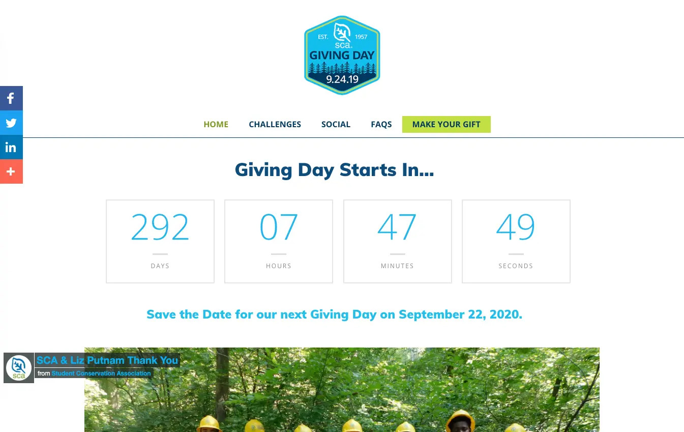
Use interactive or real-time elements on your campaign’s page to actively boost donor engagement. For instance, we helped the Student Conservation Association create a real-time countdown to their next annual giving day:

Let’s say you’ve secured a corporate or philanthropic partner to offer a special donation matching period during your capital campaign’s public phase. A real-time counter to show donors when matches will be applied or how much time is left to have their gifts matched can be an extremely effective way to boost donations during that critical period.
Brainstorm innovative ways that interactive and responsive elements can drive more engagement with your campaign. This is an increasingly popular strategy for nonprofits, especially amid 2020’s shift to virtual fundraising, so web designers experienced in the nonprofit sector should be able to help you bring any new interactive idea to life.
Getting Started with a Capital Campaign Web Page
If you’re planning an upcoming major campaign for your nonprofit, include a dedicated web page or microsite in your larger campaign plan from the start.
Having a clear sense early on of what you’ll need to get your dream page up and running will be extremely helpful. If you’re handling web design on your own, stay on the lookout for helpful plugins and apps that can simplify various elements of the process, like embedding donation forms and interactive features. For example, our top picks for the best WordPress plugins for nonprofits include tools for easily creating pop-ups and intuitive navigation menus.
However, remember that major campaigns are also major investments. To maximize the impact of your page or microsite on all stages of your campaign, we recommend working with an expert, especially if you’ll require any custom-developed features. As mentioned above, a wide range of consultants and tech experts specialize in the needs of nonprofits and can offer insights that will deliver long-term value.
We recommend creating your campaign’s page as early as possible. Use it as a resource during the quiet phase to present your case for support and explain your goals, and then continue refining and expanding it as the public kick-off approaches. A robust campaign page can make a huge difference for your campaign’s results and can lay a stronger foundation for continued engagement, so don’t wait to start tapping into those benefits. Best of luck!
 With 15 years’ experience, Ira Horowitz is an expert in nonprofit online communications and online fundraising. His work has resulted in increased funds and resounding supporter engagement for hundreds of organizations.Ira oversees our project management team and works with clients to provide our clients with the best possible final product. He also manages all of our strategic engagements and helps guide nonprofits to determine their long-term strategy goals for online communications.


Leave a Comment