An Essential Chart for Tracking Sources of Funds and Uses of Funds
If you’re embarking on a building project, chances are excellent that you will be exploring multiple sources of funding for your project — only one of which is a capital campaign.
Multiple Sources of Project Funding
Your organization may, for example, have decided to draw some money from a board-restricted investment account to cover a portion of the up-front costs. Perhaps you are exploring the possibility of a mortgage for a portion of the expense. You may be seeking government grants or tax credits.
Project funding is often a complex soup of which philanthropic giving is only one portion.
And even the philanthropic aspect of your funding is complex. After all, some funders will want to fund one aspect of your project and others will want to fund something else.
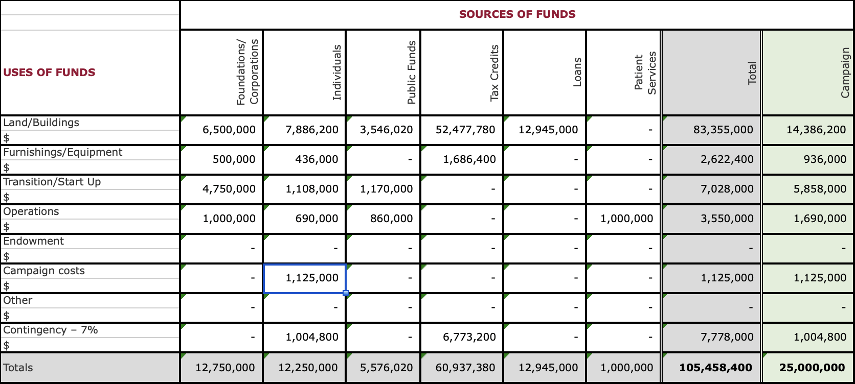
To get a clearer sense of your project funding and your campaign funding, we’ve included a Source-Use Chart in the Capital Campaign Pro toolkit. (You’ll find it in Phase one, Step 3.)
What Won’t Your Campaign Cover?
You can see the uses of funds listed down the left hand side and the sources across the top.
![]()
Your board may find it reassuring that they don’t have to raise all of the money needed for the project through their campaign.
An Example from the Field
Kevin, one of our Toolkit users, has taken that chart and adapted it for his organization.
You can see in his example that the Capital Campaign accounts for only $25,000,000 of a much larger $104 million project. Looking at his project this way provides a clear and more realistic understanding of what the goal for his campaign should be.
How Might You Use this Chart?
Let us know how you use this chart. And, of course, if you have questions about how to use it, just leave a comment below.


Leave a Comment